.png?table=block&id=d4fdd61c-0ff0-491b-ba45-e01ca9c0ae7c&cache=v2)
Image URL
AI summary
Testimonial pages are essential for building trust with potential clients, showcasing customer validation through various formats. Eight examples highlight effective designs that leverage social proof to enhance credibility and conversion rates.
Title
Date
Description
Status
In progress
Current Column
Person
Writer
If you are a business owner or marketer, your success depends directly on what your prospective clients think of your product or service.
They are the ones deciding. The faster you accept that the sooner you will improve your offers to appeal to your ideal buyer.
Still, that is just a part of the solution.
With so many product options and the vast amount of information available, you need trust and reliability to stand out from the crowd.
That is where testimonial pages come in.
A testimonial page is a perfect way to establish trust with your prospects.
Testimonial pages are a section of your website dedicated to sharing the words of validation, endorsement, and praise from your customers or users.
These experiences could be presented in different formats, such as video, text, images, URLs, social media posts, etc.
Believe me, you want and need a testimonial page.
There is no better strategy for maximizing your opportunities to convert as much of your website traffic as possible than adding this social proof to your websites.
If this is your first time creating a testimonial page or if you are just looking for new ideas, the following examples will serve you as a design inspiration.
1. The LinkedIn Operating System
Justin Welsh is a successful solopreneur who teaches other people how to build a one-person business on the internet.
His course, The LinkedIn Operating System, helps LinkedIn users grow and monetize their accounts.
Over 25000 happy students worldwide have taken this course, which is one of the most popular, if not the most popular, on the topic.
Like most courses, Justin relies heavily on social proof to spread the word about The Operating System and acquire new students.
As you can observe, Justin showcases a minimalist website that is highly focused on social proof.
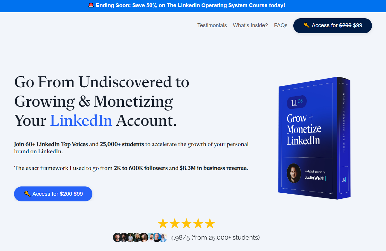
You can tell that is the case because of elements like this one:
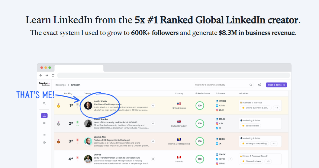
It showcases Justin as the #1 Ranked Global LinkedIn creator, according to Favikon.
Do you see how that adds value and momentum to the first glimpse of the prospects’ visit to the site?
Another element that shows that Justin is really into leveraging social proof is the Testimonial.to badge that he added to his page:
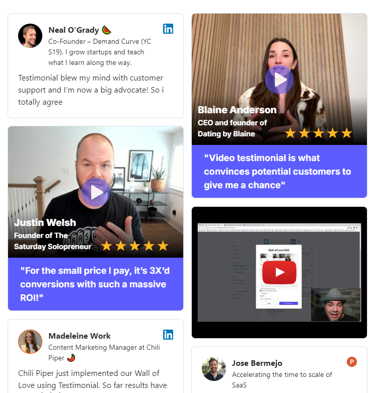
He also made an active and conscious effort to include multiple high-quality video testimonials on his page:
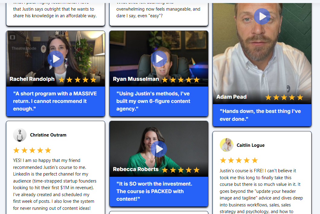
As you can tell by the number of course sales and testimonials captured, Justin is really making good use of our testimonial-collection tools and I can really tell he is loving them.
You can also confirm it because he left a very nice video testimonial on our Wall of Love.
2. Alcove
Alcove is a trusted platform for leasing private bedrooms in single-family houses.
The process of finding a long-term rental can be stressful or even painful at times.
Alcove can make a difference in your mental health and financial and physical safety.
They can help you make that experience safe, easy, and affordable.
How? By contacting them and trusting their process. Literally, all you have to do is sign a lease, and they will take care of the rest.
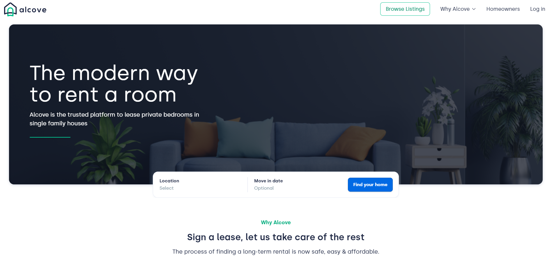
Their website looks relaxed, clean, and modern.
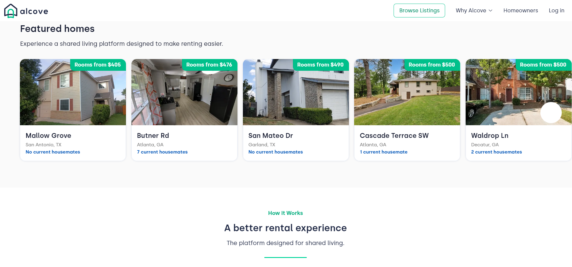
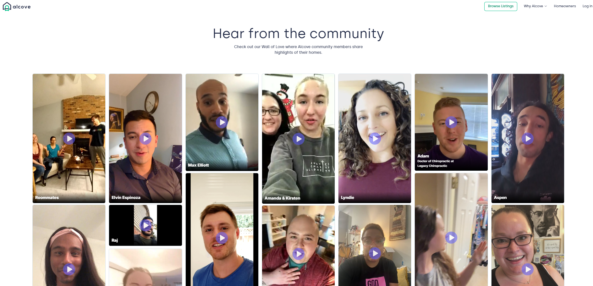
Since this niche is also very reliant on social proof, Alcove’s homepage showcases an attractive testimonial slider widget on the home page.
It features video testimonials only.
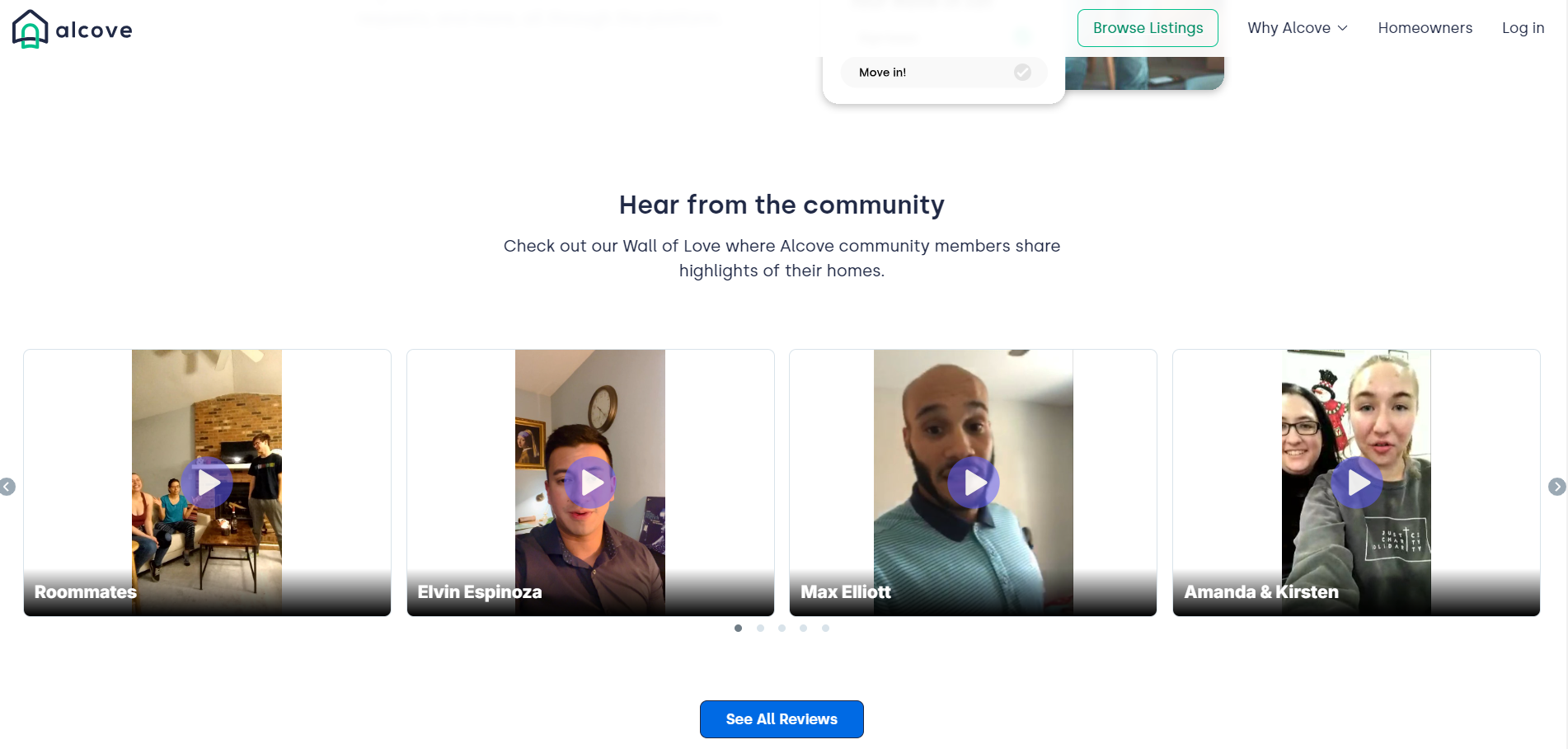
If, as a user, you want more, all you have to do is click the “See All Reviews” button or follow this link. You will be directed to Alcove’s dedicated testimonial page.
This page showcases a Wall of Love where Alcove community members share highlights of their homes.
3. Superhuman
Superhuman is the most productive email app ever made.
It allows you to collaborate faster and get more done with AI-powered email.
Superhuman features will help you reply on time, faster, and effortlessly. You can add a few ideas, and their app will turn it into a full, high-quality.
Sales, customer support, and internal collaboration were never this easy.
Using Superhuman, you could save 4 hours per person every week.
What would you do with that time? How many hours in total would you save if your whole team used Superhuman?
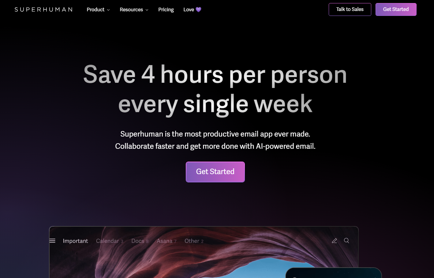
Superhuman’s website is very, very aesthetic. After scrolling a bit you will easily be able to agree with me.
The colors, combinations, motion effects, gradients, icons, and other elements were combined in a perfect blend of creativity and practicality.
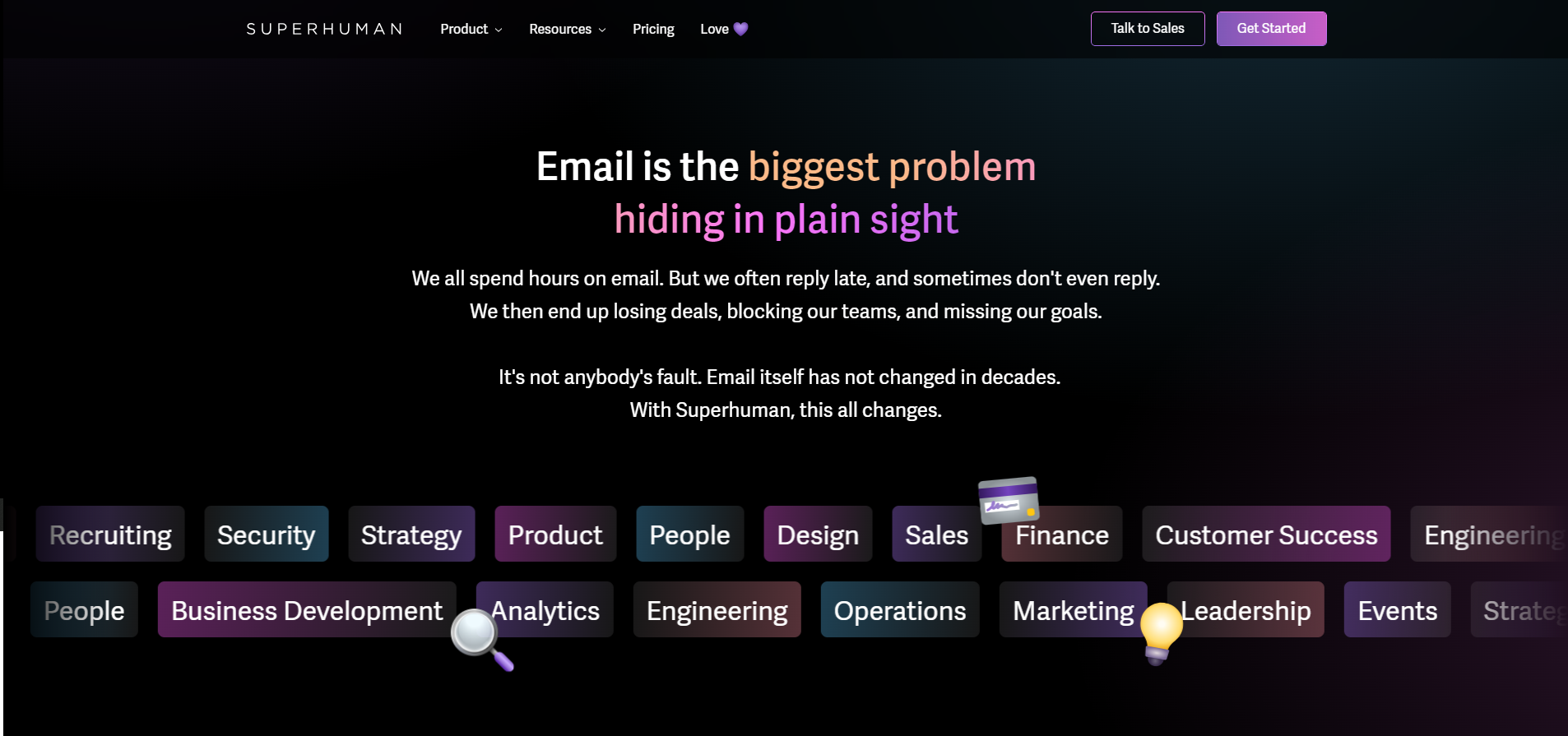
The home page’s design is itself a sales agent, ready to attract the attention of any reader.
If that’s not enough to convince you to become a user, all you have to do is head to the “Love 💜” section on the header, and BOOM…

You will be redirected to Superhuman’s dedicated testimonial page.
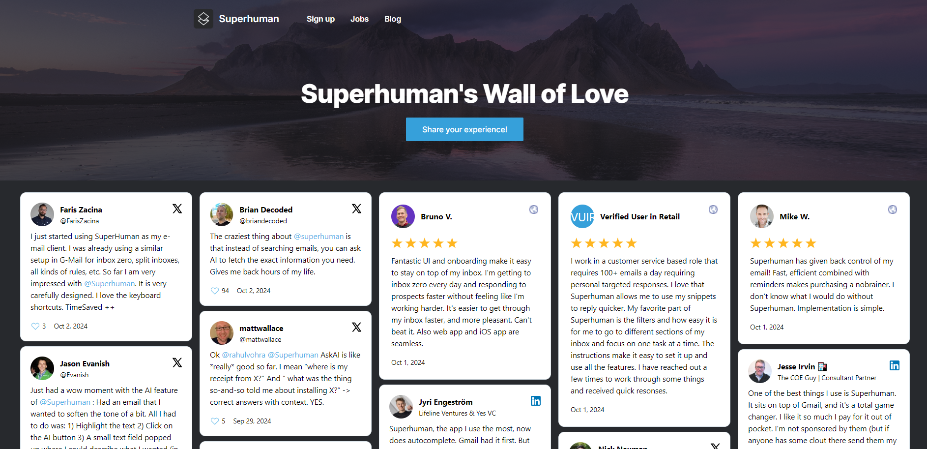
If I had to give an opinion about this testimonial page in just a few words, I would say it is “VERY impressive.”
You should take the time and give a look by yourself.
If you haven’t clicked on any of the links above, you can click this one to visit Superhuman’s testimonial page.
The page includes dozens (if not hundreds) of high-quality reviews, testimonials, and other experiences that endorse Superhuman as an excellent tool for making email an effective part of your workflow (not a burden).
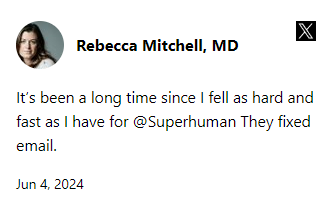
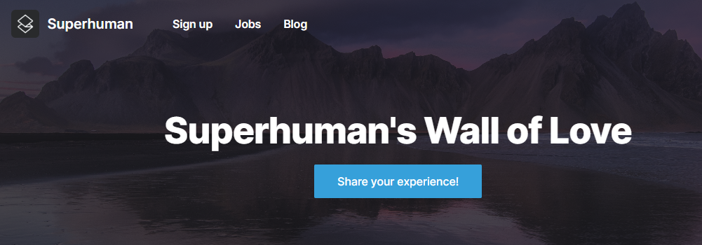
Superhuman’s dedicated testimonial page keeps getting filled with reviews from G2, LinkedIn, X, and many other sites daily.
It also includes links to relevant sites like Superhuman’s blog. jobs, page, and call-to-action links to sign up for their product and a link to their Testimonial.to experience collection widget.
4. Un-Ignorable Hooks Email Course
Demand Curve is the ad agency for startups.
They have worked with big brands like Ancestry, Intercom, Zendesk, Slack, Stripe, and Shopify.
They also host a 36-day cohort course, Un-Ignorable, as part of their training services. The course focuses on helping founders to grow their personal audience.
The Un-Ignorable Hooks Email Course is a free 12-day email course that teaches you the ten ways that top creators get you to stop and listen.
You probably are influenced by these types of hooks every day without ever noticing.
How would it be to be on the other side?
What would you do if you had the power to make people read your posts every time?
Well, this course is free, and I am pretty sure you won’t regret taking it.
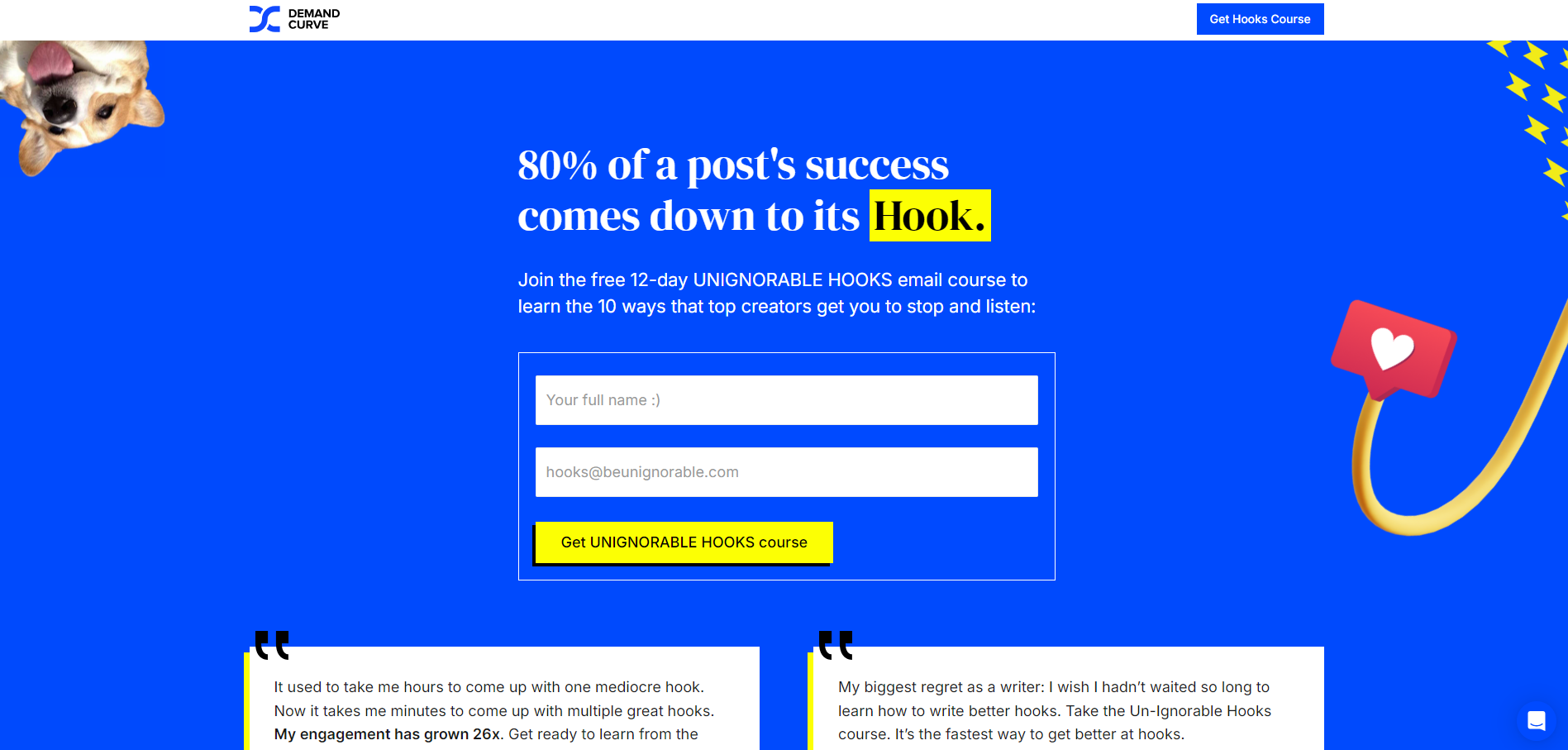
The landing page for this section of the site is very colorful, creatively distributed, and looks very novel.
That corgi in the corner makes it almost irresistible not to read! 🐶
If you notice, Demand Curve’s page tries to leverage social proof right from the start by including two text testimonials.
You can tell this is one of their “hooks”:

Then the site literally captures readers with these powerful, visually-supported explanations of what you will get if you join this free email course:
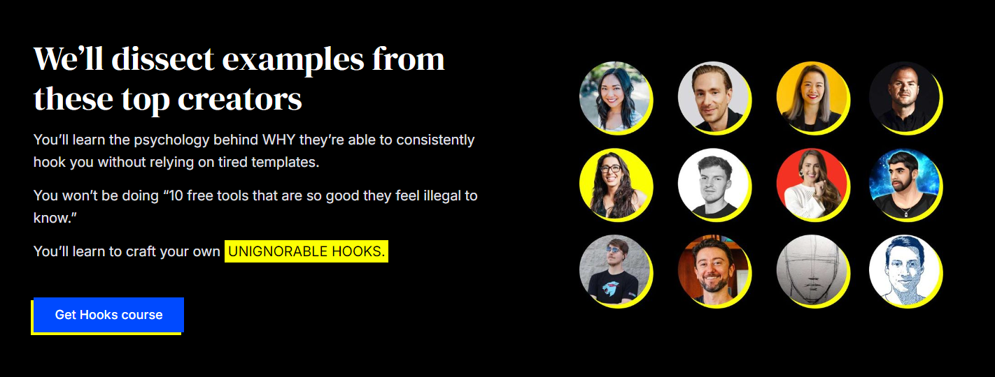
The FOMO caused by the familiarity of these influential creators makes the page truly UNIGNORABLE.
Finally, the combo wouldn’t be complete without a beautifully designed Testimonial Wall of Love:
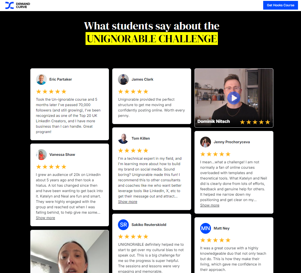
Crowned with a final call-to-action button:
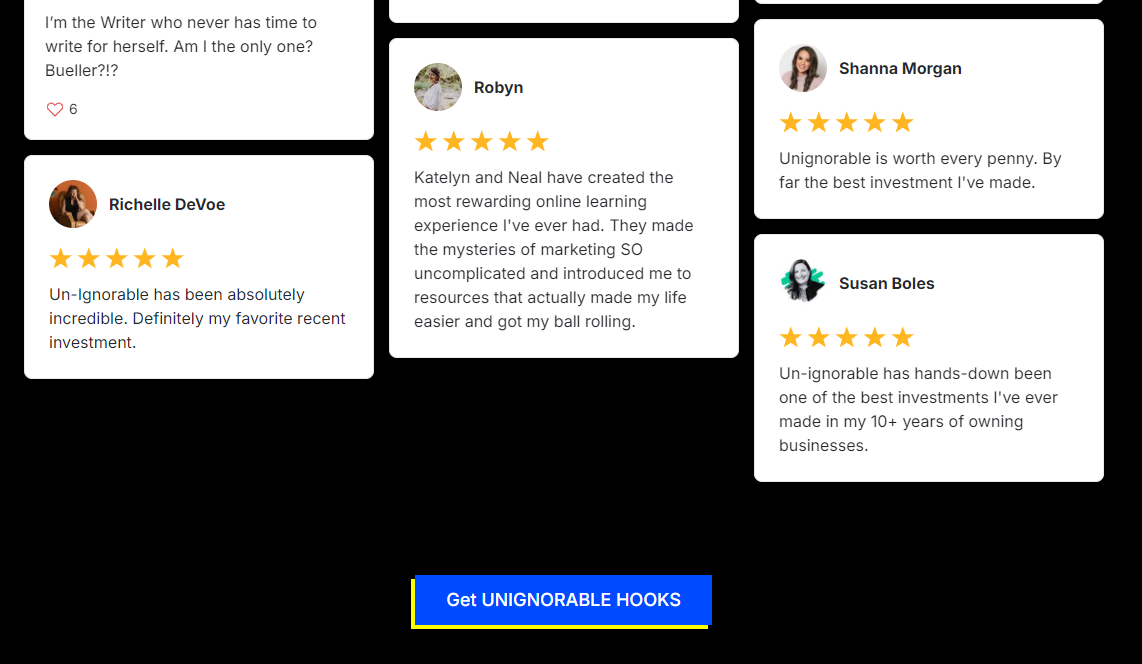
I actually will go and sign up for their challenge now!
Props to the designers involved in creating this landing page.
5. Pip Decks
Welcome the new way to have expert knowledge in your back pocket.
Pip Decks are confidence-boosting business toolkits: practical step-by-step recipes that upskill you and your team.
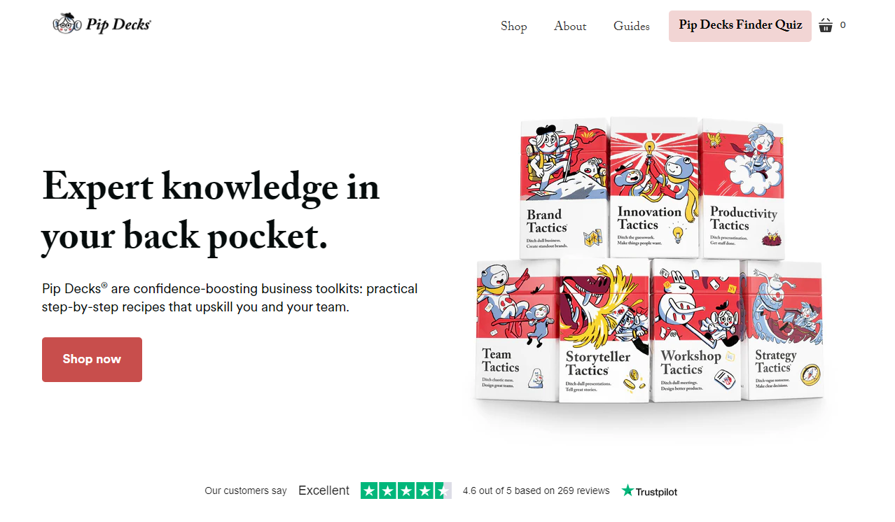
Pip Decks has sold tens of thousands of copies all around the globe.
It’s trusted by people at the BBC, Microsoft, Google, Apple, Meta, Stanford University, and Lockheed Martin—the list is endless.
So, it’s not a surprise that their reviews and testimonials page is so rich and nurtured with love from their clients.
What’s so original about this testimonial page that caught my attention?
The fact that Charles Burdett, the founder of Pip Decks started the magic showcase by sharing a written intro first, supported by a call to action inviting customers to leave a review.
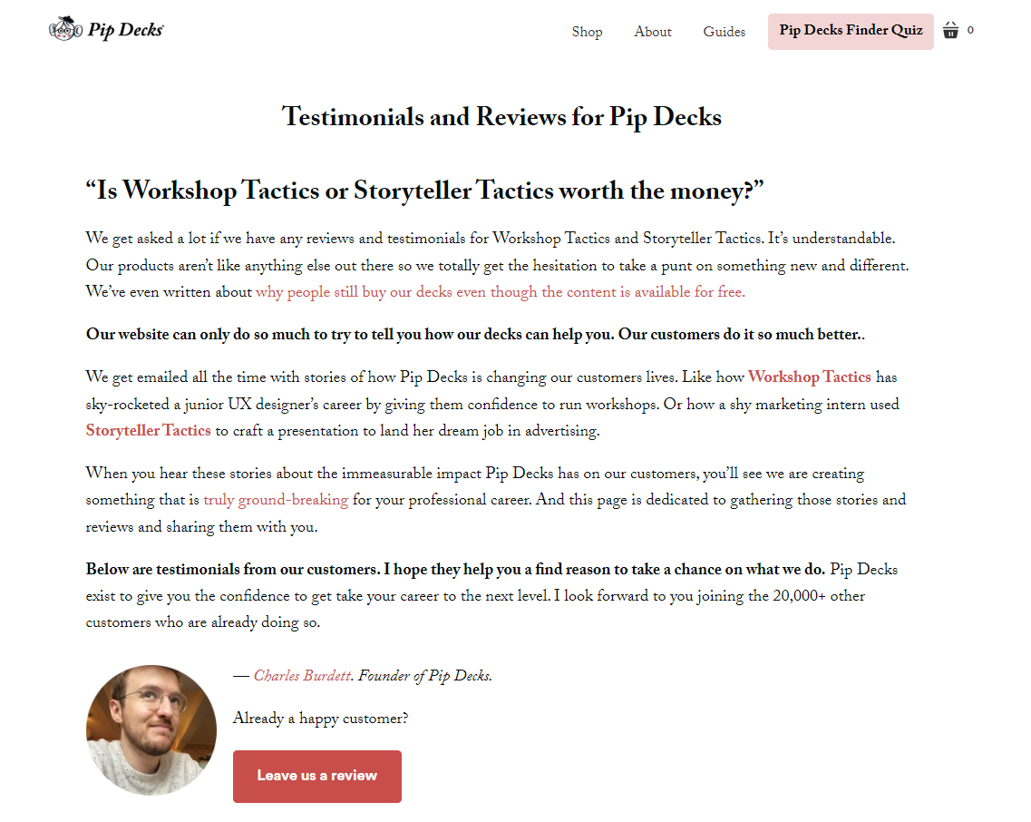
What comes next is something unexplainable. You need to visit their testimonial page to understand it:
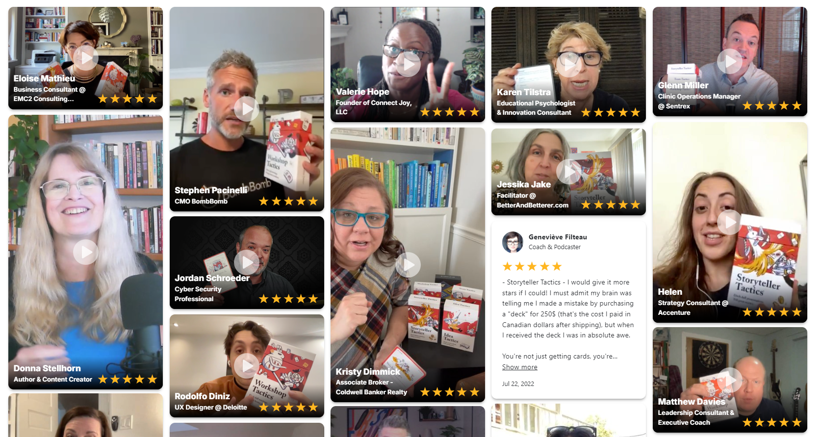
And the love keeps going and going!
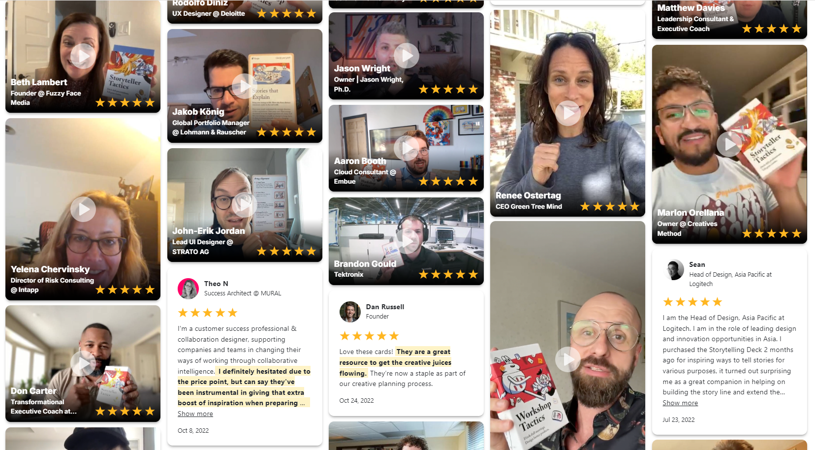
Well done, Pip Decks Team. Anyone who visits your testimonial page will be able to notice the same thing that I do: that you have built a product that your ideal customers will LOVE!
6. Agency Mavericks
Agency Mavericks provides coaching, training, and community for agency owners who want to start, grow, and scale.
If you’ve got a vision for the agency you want to build, they will help you make it a reality.
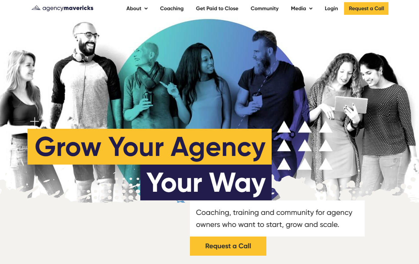
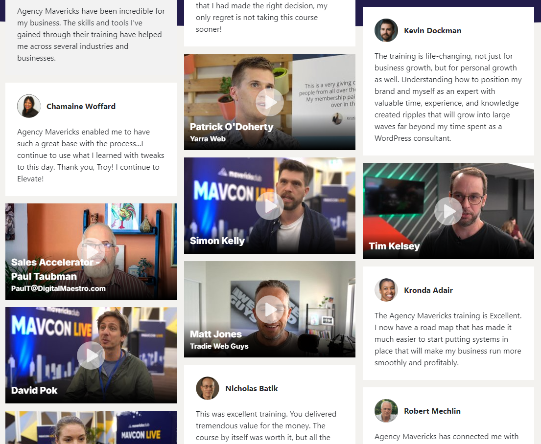
The Agency Mavericks site is very original. It has a futuristic style and combines color combinations, opacities, and other graphic elements that we wouldn’t find on mainstream coaching sites.
I can honestly say that they dared, were bold, and succeeded.
And I can’t say less about their testimonial page.
It exhibits the same original style, and it’s so well-detailed that even the “Play” icons on every video have the right type of white color and opacity so that they testimonials make a perfect match with the background and the overall landing page. I love it!
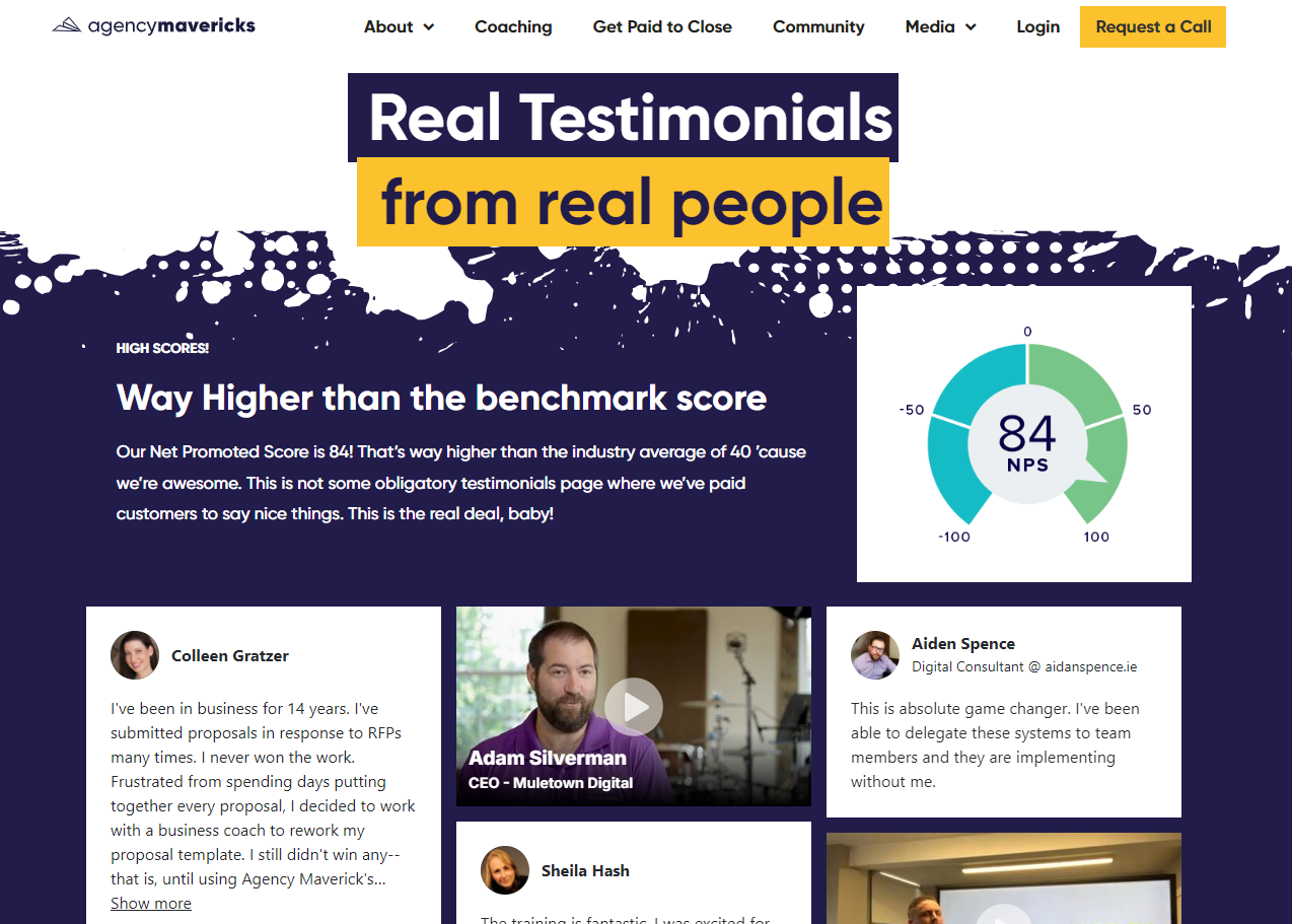
The love from the clients is, of course, the cherry on top of the cake.
7. Outstandly
Outstandly is your very own game art team.
They help you build badass concepts, 2D, 3D, and VR worlds, animations, and UX/UI one-stop metaverse.
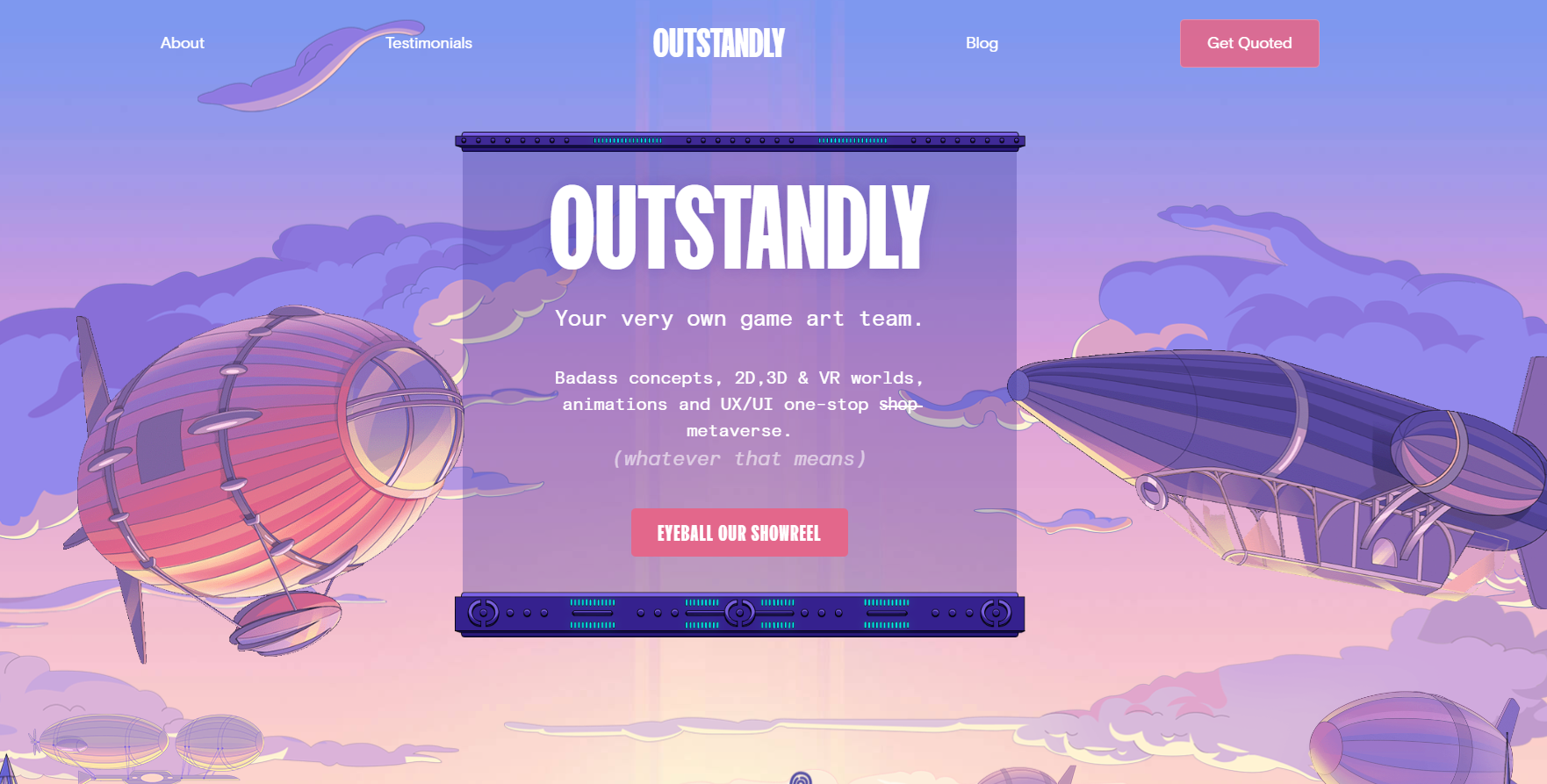
They probably have an advantage over the other pages shared previously because design is their main thing, but well, who is competing? 😄
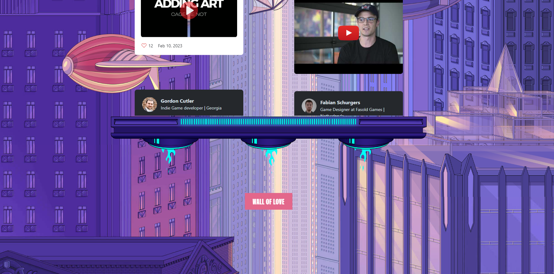
Their homepage combines a very aesthetic showcase of past projects with some individual client testimonials.
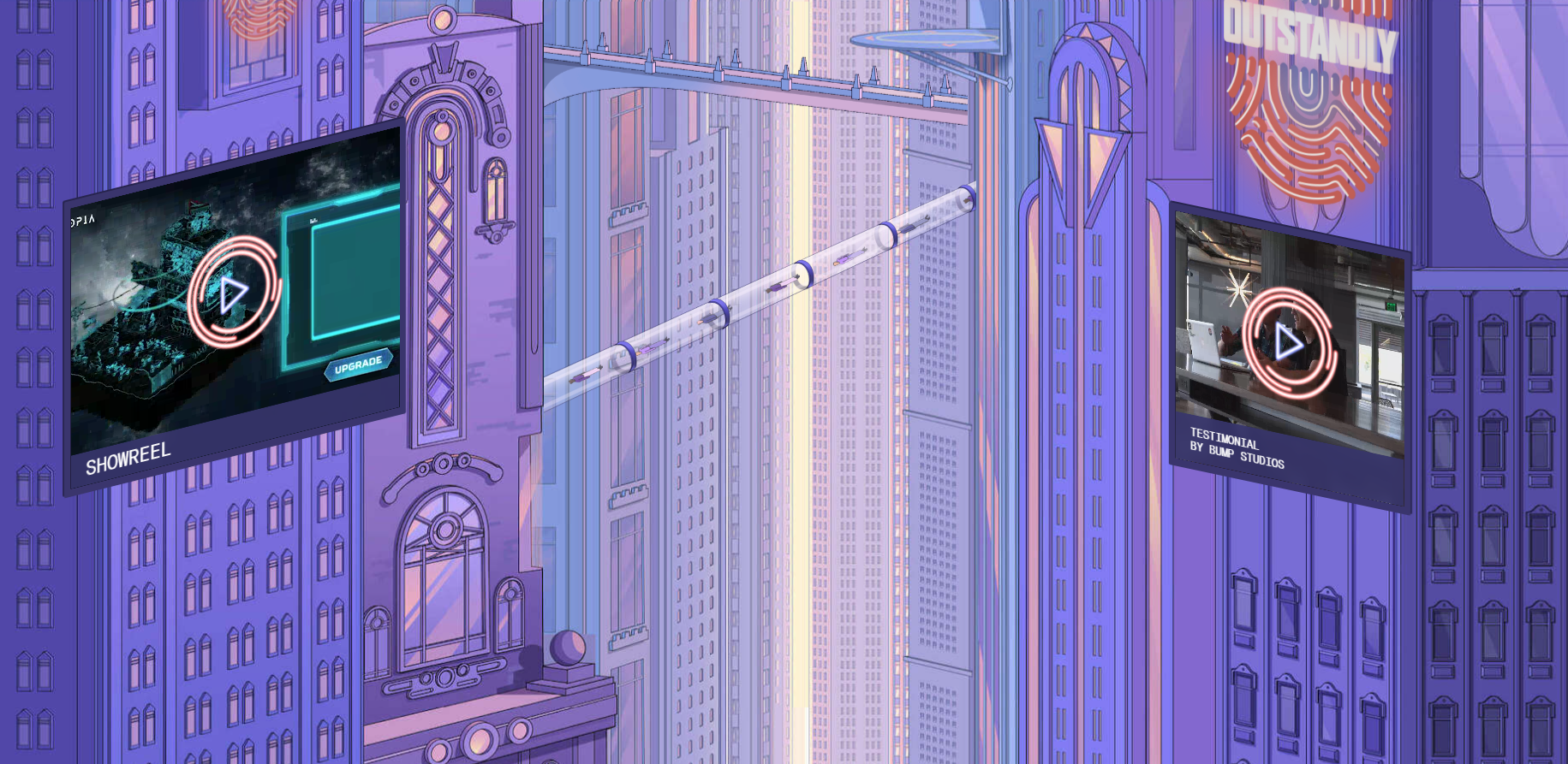
If you keep scrolling, you will find a great example of how to use the Testimonial animated Wall of Love feature:
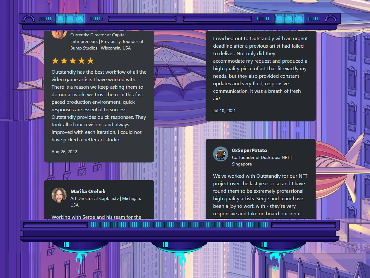
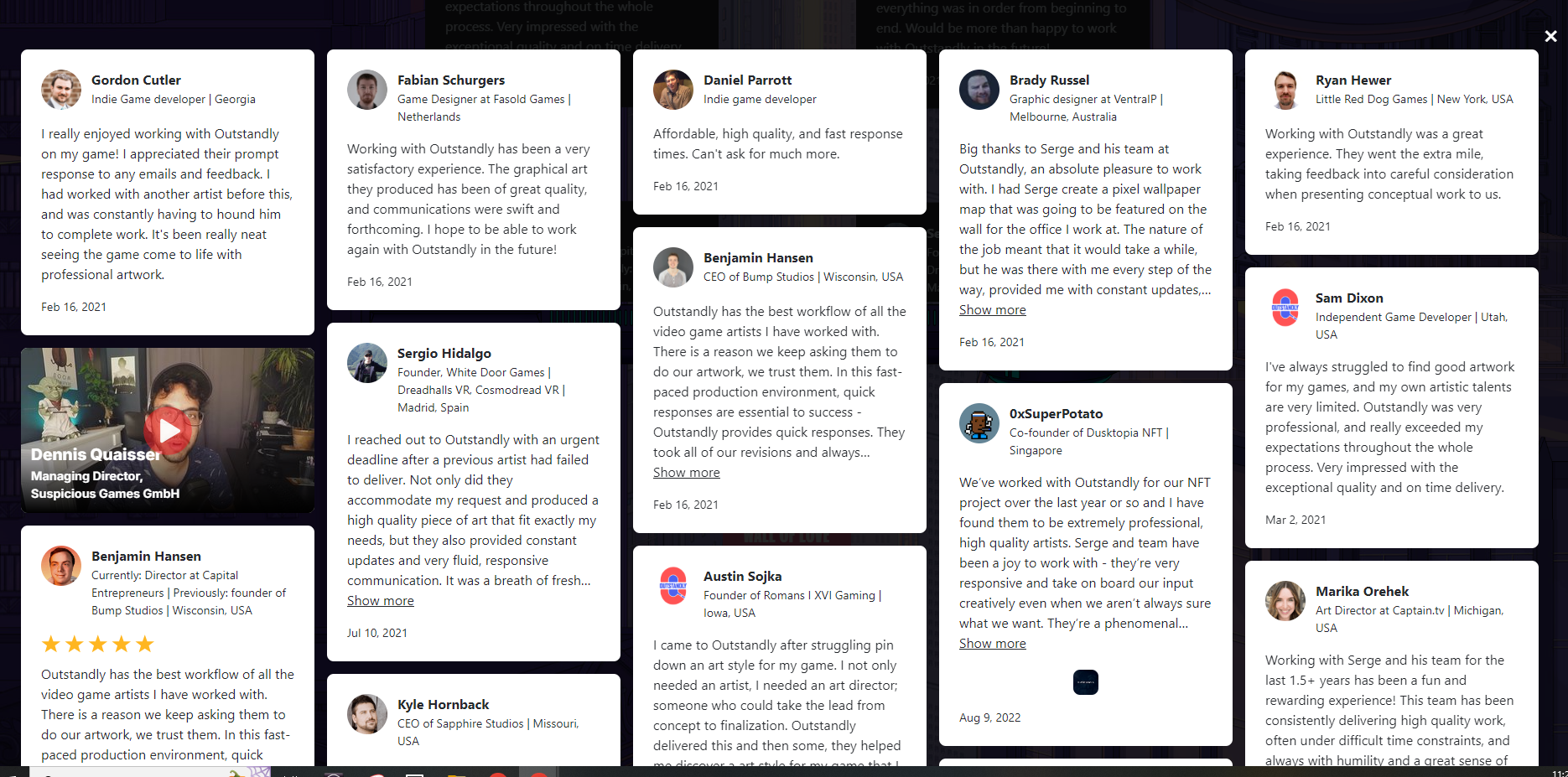
And finally, a link to see their full Wall of Love:
Which, instead of opening on a new tab or window, will open as a smooth pop-up:
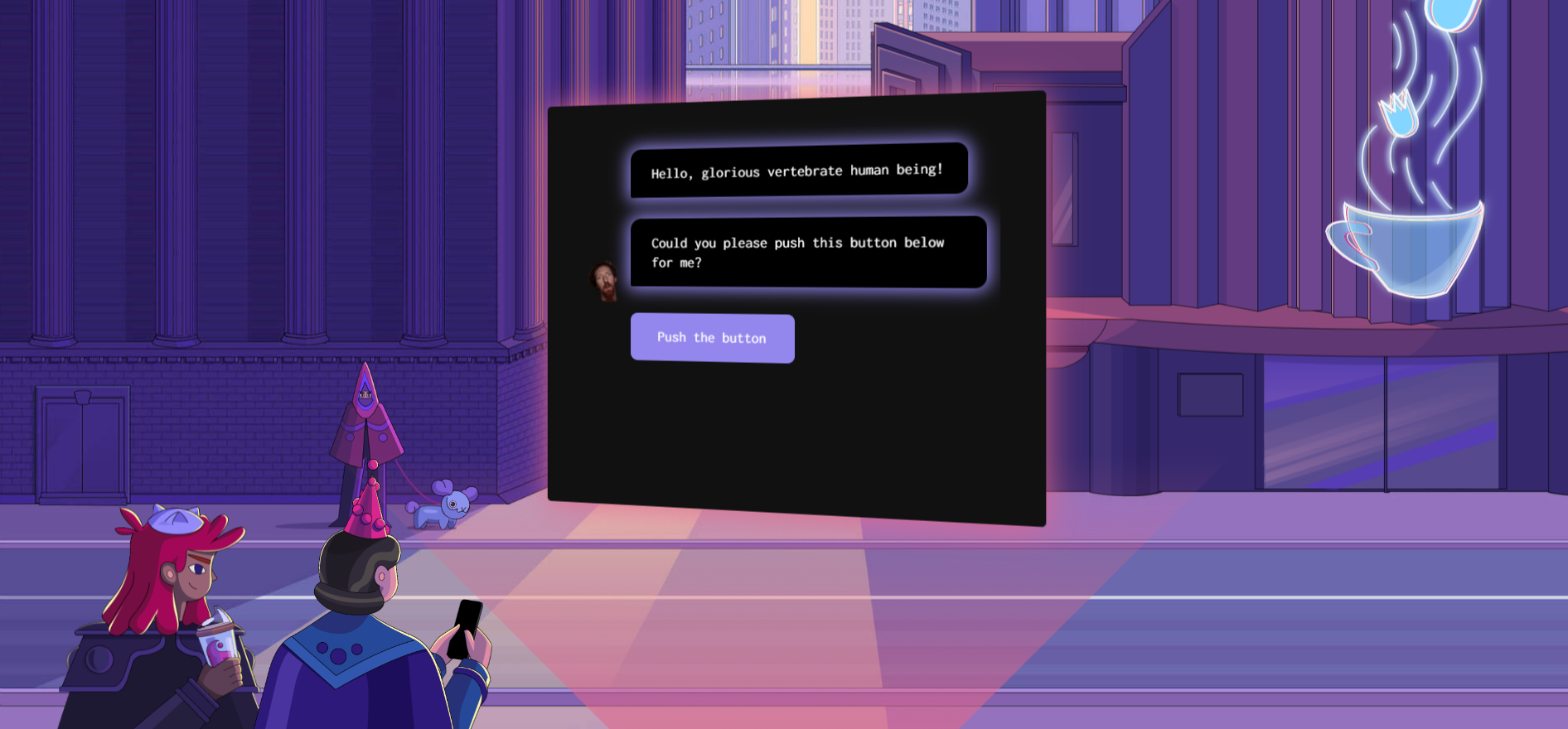
But hey, don't take my word for this. Visit their site for the full experience:
8. Instrumentl
Instrumentl is the future of grant management.
It helps you find relevant grants, secure more funding, effortlessly manage awards, and scale your team’s impact.
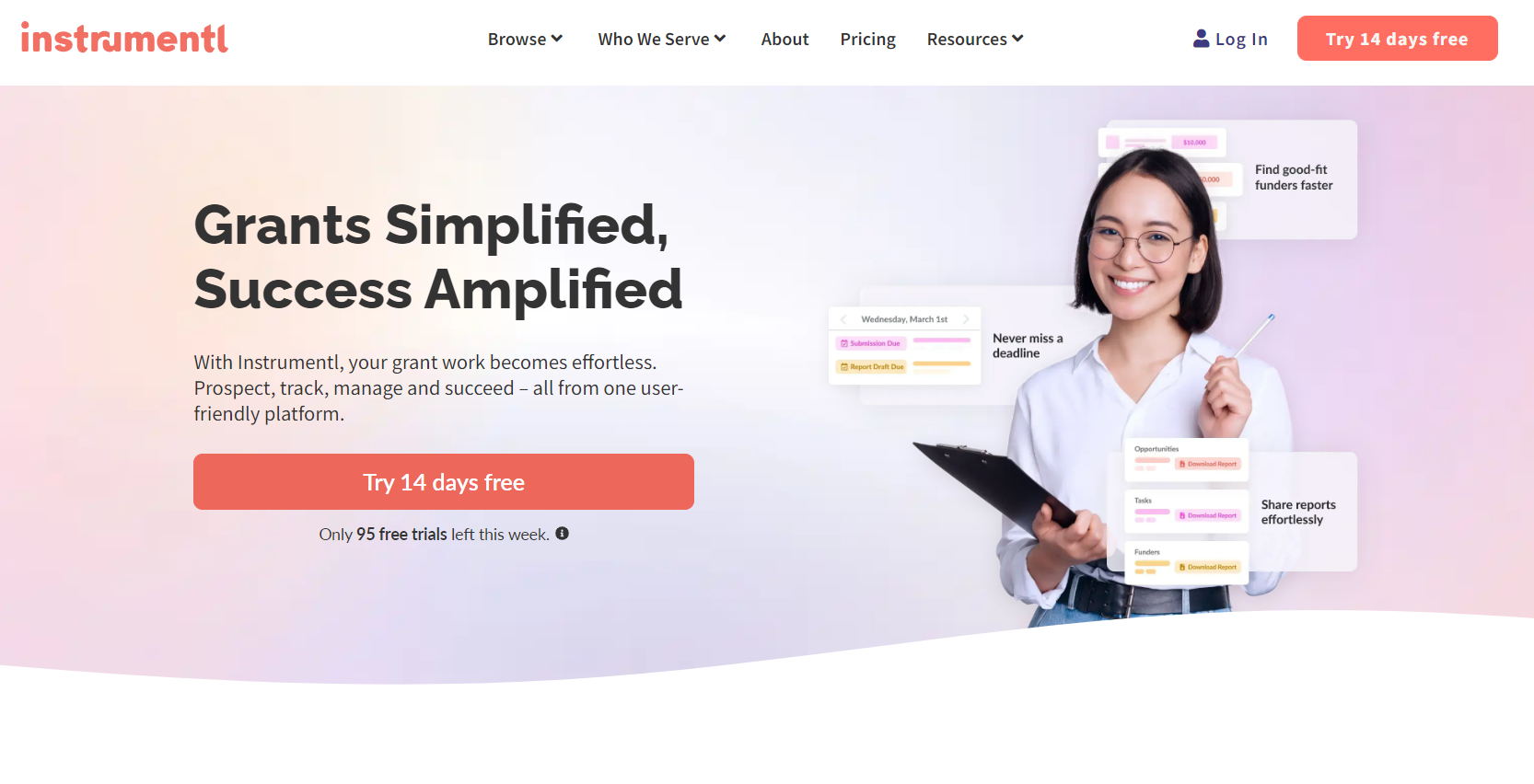
The “Who We Served” section will take you to their testimonials page.
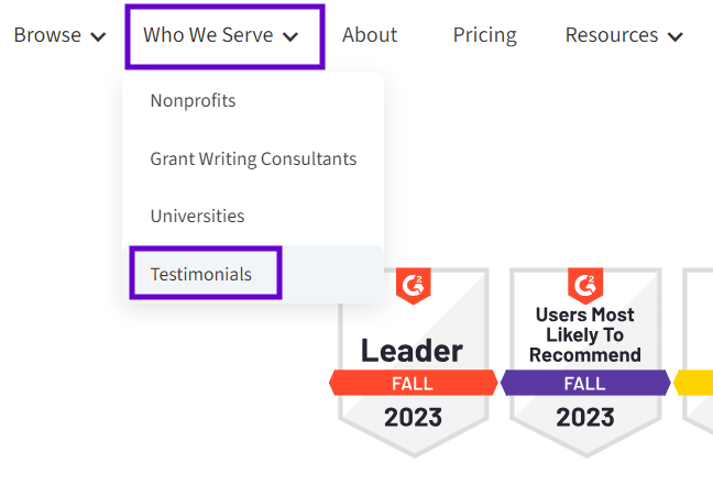
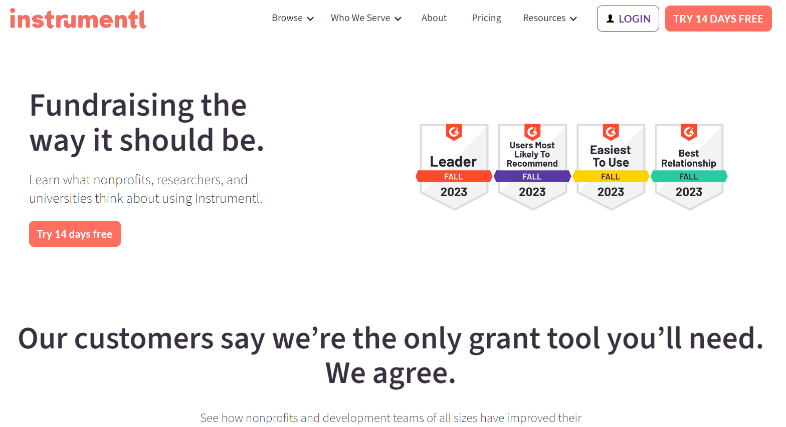
Instrumentl’s testimonial page is simple but very practical. It includes:
- A link to try their product for free
- Images featuring their G2 badges (grant management awards)
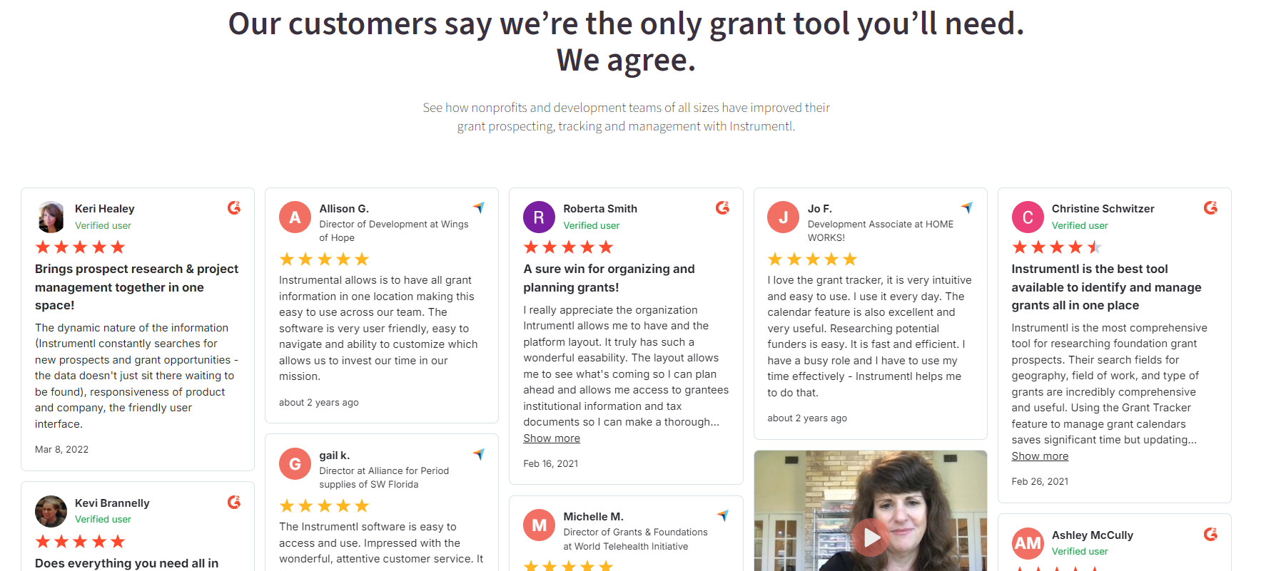
And then… Drums, please! 🥁
A very rich Wall of Love crowns the page, populated with a bunch of high-quality G2 and Capterra reviews as well as many other videos, image, and text testimonials collected by the Instrumentl team using Testimonial.to.
Okay, this was our list of 8 Good-Looking Testimonial Pages to Get Inspired By.
Which one was your favorite and why?
Whichever you liked the most, remember that the most important thing is finding a design, voice, and tone that will resonate with your target audience and ideal customer.
You know what type of elements will give you success are better than anyone, so don’t be daunted by the task of creating a testimonial page; trust your gut and go with the design style that makes sense to you according to your niche and industry.
Remember, you can always change things later down the road.
Also, if you are considering doing this without a designer or developer, probably the best option for you is Testimonial.to.
Collecting testimonials is hard, we get it! So, we built Testimonial. In minutes, you can collect text and video testimonials from your customers with no need for a developer or website hosting.
