Image URL
AI summary
Title
Date
Description
Status
Current Column
Person
Writer
You must have heard the saying that “Your website works for you 24×7”.
That's absolutely right, but you need to keep your website groomed and presentable to make sure your audience sees the best version of it, which leads to better conversion rates.
In this article, we'll discuss why it’s important to optimize your website for better conversion rates and also a few tips which you can implement right away.
Why is it important to optimize your website?
Optimizing your website for conversion means achieving the most out of your website. Your website needs to be designed to convert. This is the only way to get sales. Getting more visitors is great, but you must turn those visitors into leads, subscribers, and customers.
A few important reasons you should optimize your website:
- Convert more visitors
- Get better ROI from your paid campaigns
- Create long-term organic growth channel
- Reduce cost of acquisition of new users.
What makes a good converting website?
There’s no hard and fast rule that defines if a website will convert well or not, but there are certainly tips which you can follow to improve your website conversion rate.
This includes having an engaging and relevant copy, clear call-to-action buttons, social proof in the form of text and video testimonials.
Now let’s directly jump into understanding these ways so you can improve your website’s conversion rate and achieve more conversions with little to no effort.
Simplify your headlines and subtitle
Your headline and subtitle are among the first few things that a visitor will see the moment they land on your website.
Now, it's the role of your headline and other elements to grab the attention within the first few seconds of them being on your landing page.
Users often leave Web pages in 10–20 seconds, but pages with a clear value proposition can hold people's attention for much longer. To gain several minutes of user attention, you must clearly communicate your value proposition within 10 seconds. — NN Group
The easiest way to achieve this is to by making your headline and subtitle easy to read and should have user requirements mentioned.
Here’s an elegant example from MailerLite’s landing page, which easily answers multiple user needs with just 1 headline. The same goes for their subtitle, too.

If you are getting confused and finding it hard to write a better copy for your headline, then here are a few headline formulas that will help you write one.
- Want {Desired Output}? Get {Solution/Product} Now: Example
- {Solution} For {Audience}: Example
- {Product}: The {Requirement} Ways to {Desired Output}: Example
- Your {Target Audience} Hate Their {Problem/Product}: Example
- A Smarter/Better {Solution} For {Target Audience}: Example
You certainly don’t need to be a copywriter to write great headlines and subtitles - just stay clear with your messaging and talk about the problem your product solves.
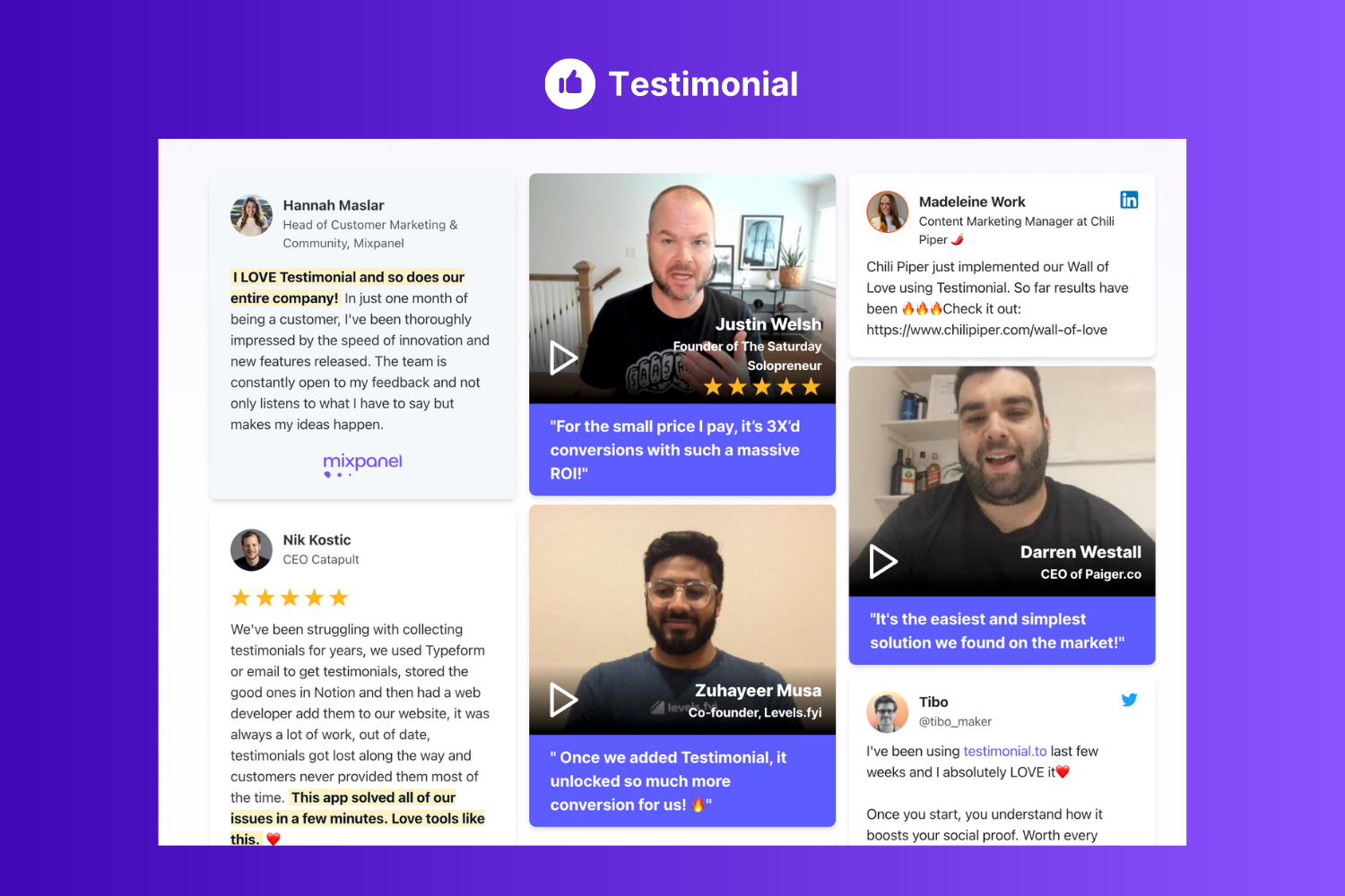
Add social proof and user testimonials
We, humans, tend to do what others like us are doing or have already done.
This is why you’ll see e-commerce sites add product ratings, reviews, and a lot of users who purchased the item. It helps in conveying trust and psychologically makes the user want to buy it.
You, too, can achieve this on your website by adding a testimonial section that shows user feedback and reviews.
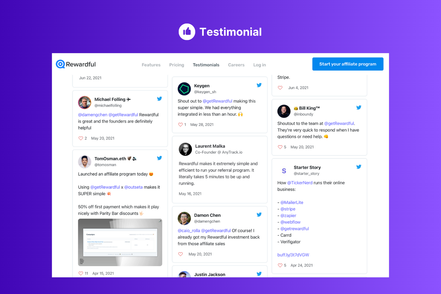
Furthermore, having video testimonials will have more impact compared to text testimonials.
One benefit that video testimonials have over just plain text testimonials is that it passes more trust as the viewer can literally see the other person talking about your product.
Plus, we all know that videos have higher retention compared to text.
To achieve this you can simply use Testimonial.to which provides you with a simple straightforward way to collect text and video testimonials and embed them directly on your website.
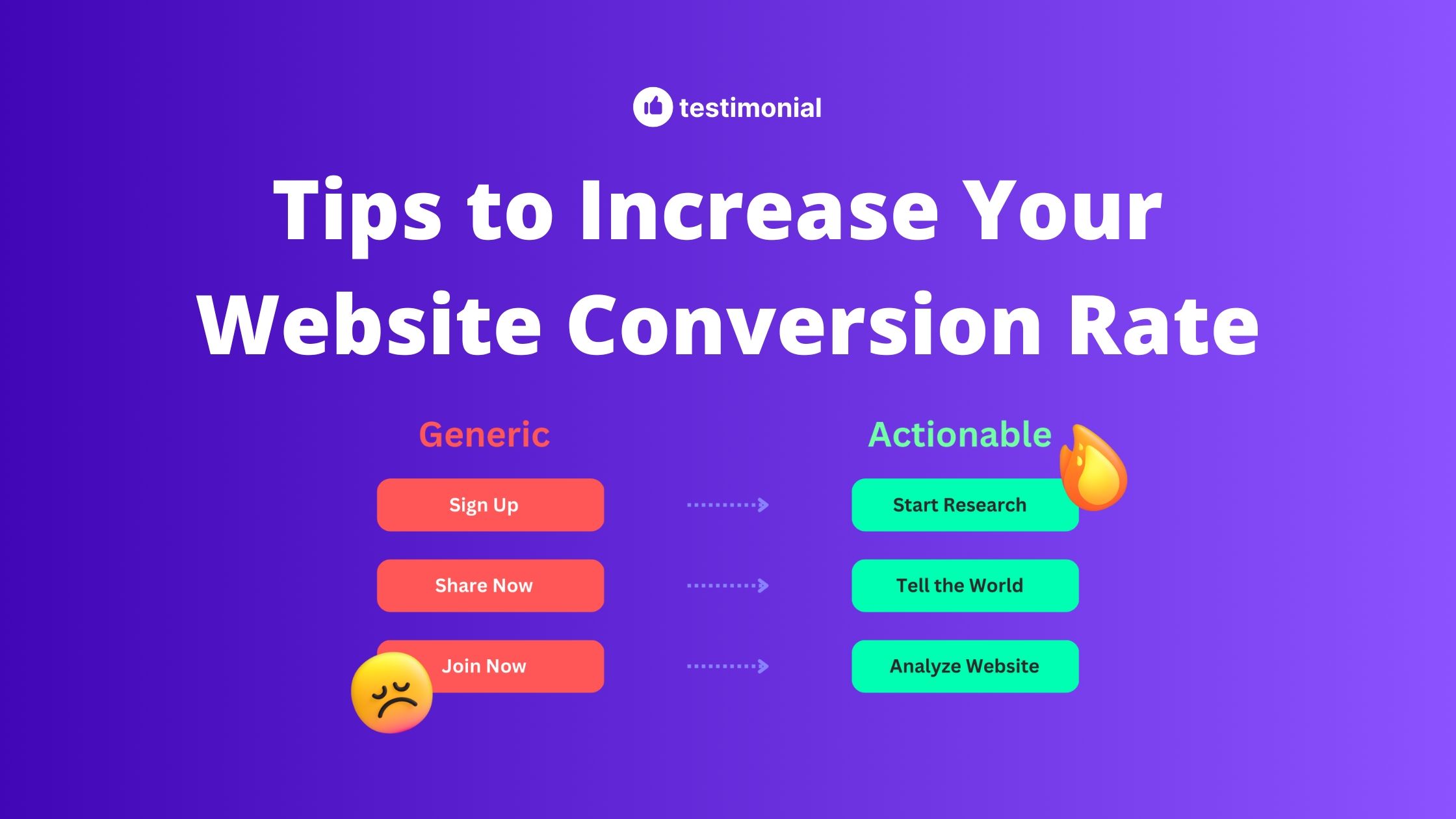
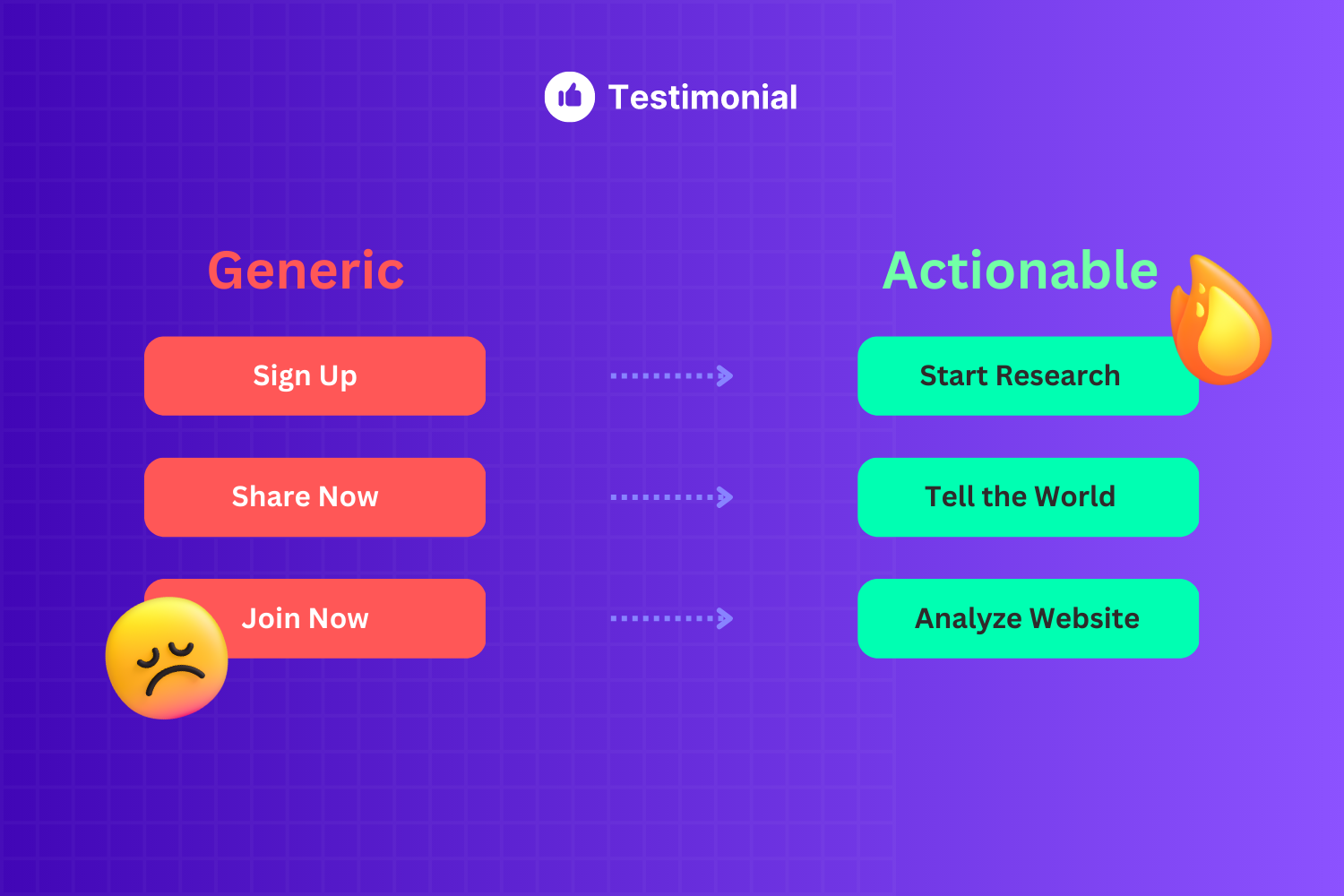
Make your CTA actionable
A CTA or Call to Action is the key to unlocking conversions, so it better be impactful.
One should always refrain from using generic CTAs like “sign-up” or “join now”. Below is an example of how you can make your CTA actionable.
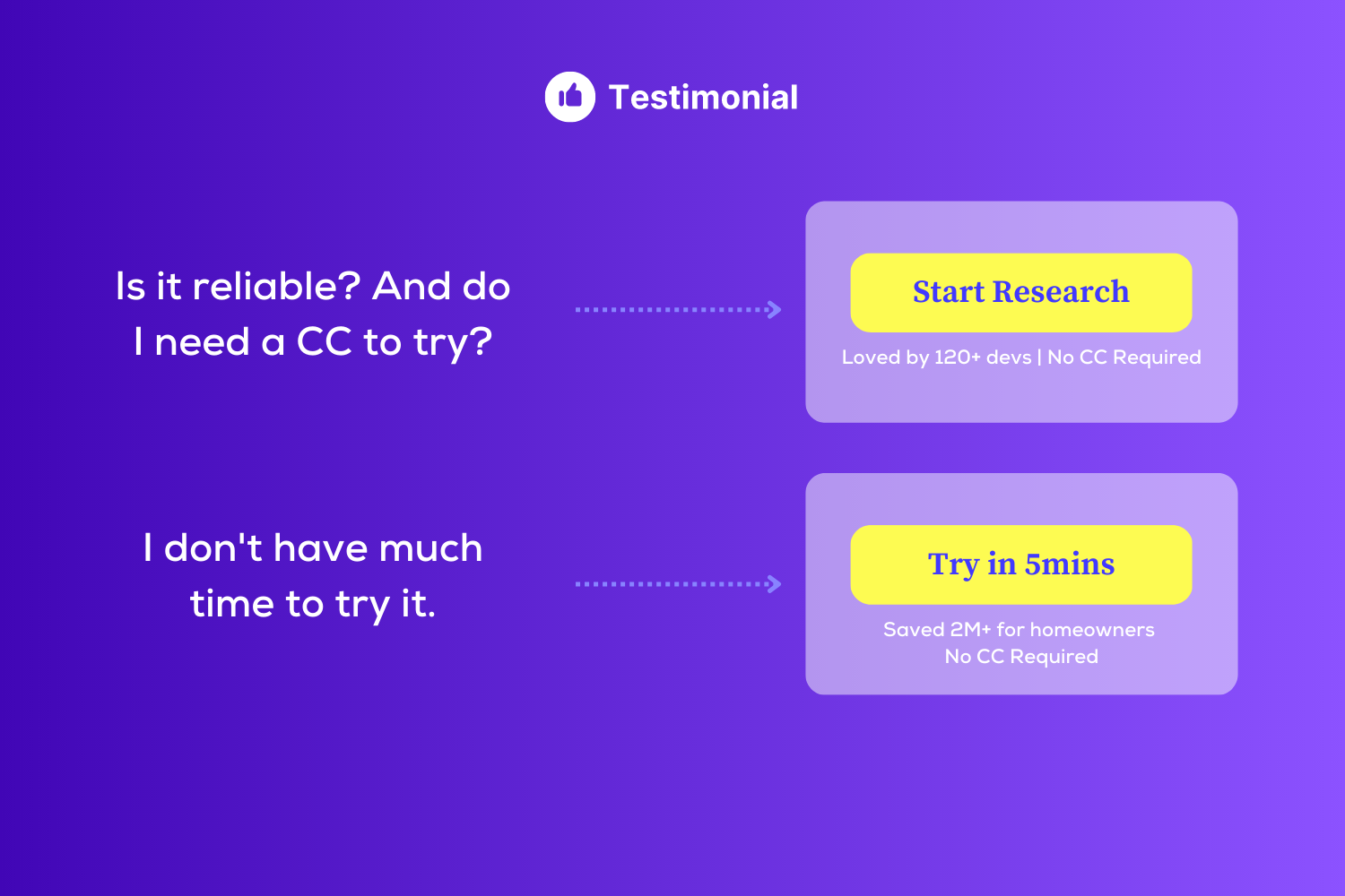
Reduce the risk to act
It's normal human nature to resist things they don't know about. It's the job of the landing page to make sure that the visitor sees no risk in a commitment.
There are 2 examples below.
- CTA with risk reduction phrases, so assume that you liked the product but were skeptical to pay. Now, this CTA should say that it's been loved by others like you, and also you need not pay to try.
- Now the second example, you really liked the product and wanted to try it, but you don't have much time now. Then this CTA will come into action. Don't have enough time? Trying it takes only 5 mins.
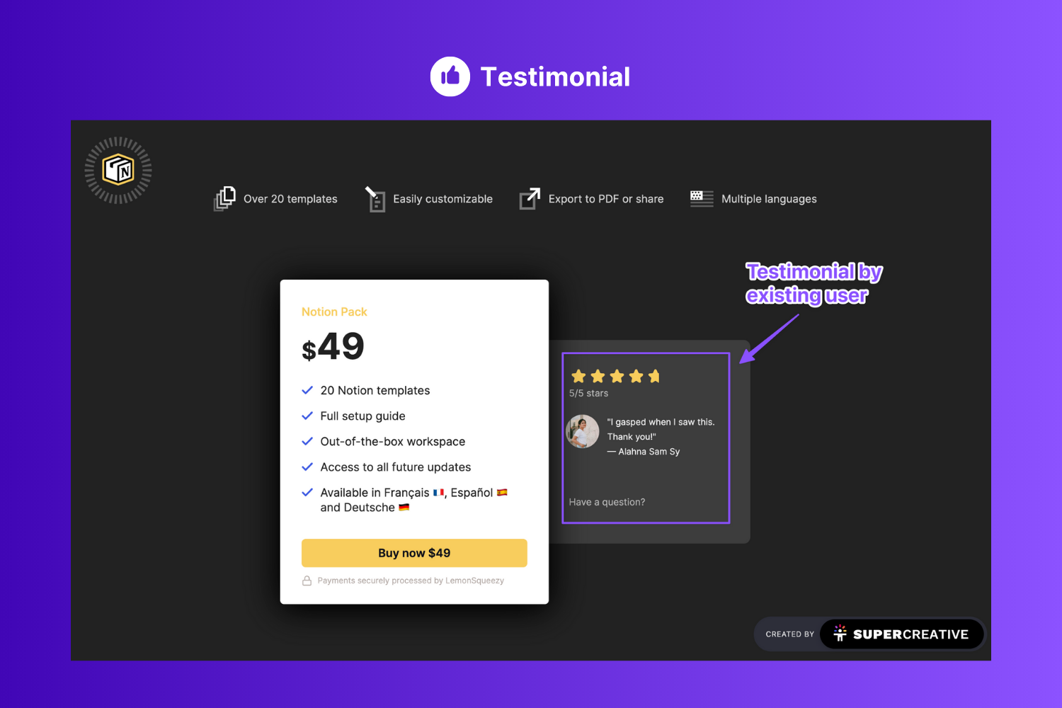
Reinforce pricing
Pricing page/block are where the actual conversion happens.
There is always a chance that someone who's seeing your pricing will give a second thought before purchasing.
Now, this is the time when you push the value of the product so that the user stays motivated and excited towards the purchase.
Look at the image below; the testimonials are strategically placed close to the pricing so that it keeps reminding the user about the value it packs.
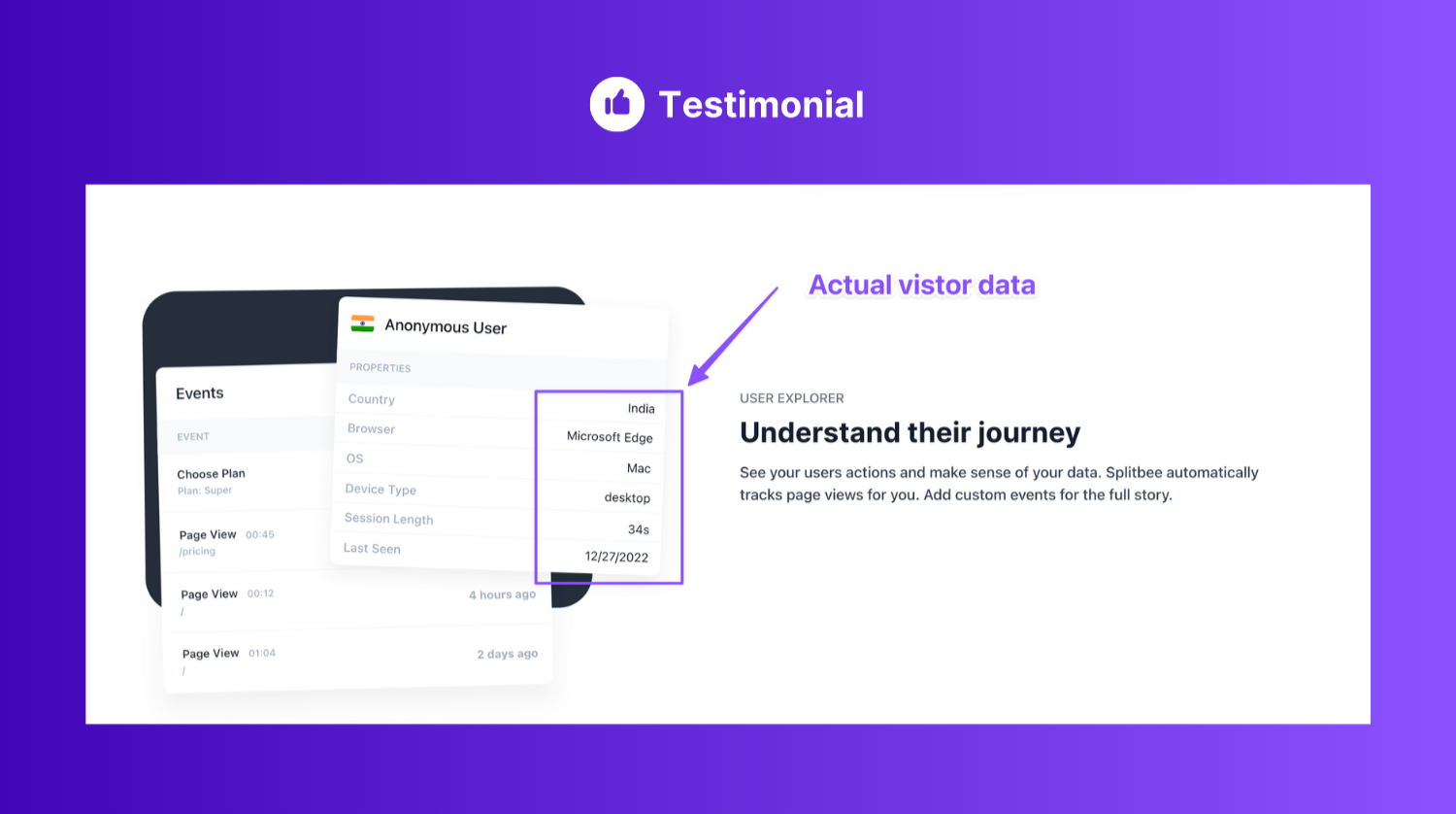
Make it personalized
People buy things from a brand they can connect with; if your landing page fails to connect with the visitor, then you probably won't be able to connect with them.
The best way to make sure that your landing page connects well with the user is to show personalized content. Understand your demographics and build accordingly.
This image is from Splitbee.io's landing page. They show user data on their images (generated dynamically). This makes sure that the user gets a personalized experience.
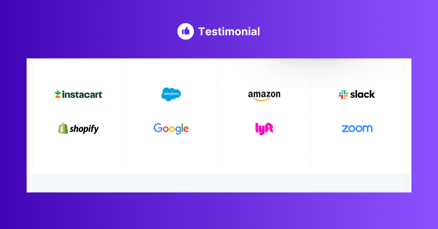
Here's another example from Stripe. They show a custom user logo based on your country. As I'm from the US they show me logos of some top MNCs, Startups, and small businesses in the country.
This also says that they have built a platform for every type and size of business.
If you'd see this section from a different country, then these logos would be different.
Wrapping up…
These are a few tips which you should absolutely follow and implement to improve your website’s conversion rates.
I am pretty sure you’ll enjoy the boost in conversion rate that you’ll achieve with the tips 💪
As a reminder, Testimonial.to is free to get started and you can start collecting video testimonials from your customers in no time!
Thank you for reading, here are two other articles you might find useful:
Written by

